Do you want to preview the mobile version for your WordPress site? the mobile layout information helps you see how your website looks on mobile devices.
While you can certainly take a look at your live site on your phone, it does not help during the development phase.
When your site is live, it is often easier to display the mobile version on a desktop computer, so you can quickly make changes and see their impact.
In this article we will show you easy ways to preview the mobile layout of your WordPress site without using different devices.
Why You Should Preview Mobile Layout of Your Website?
More than 50% of your website visitors will be using their mobile phones to access your site. Around 3% will be using a tablet.
This means that it is necessary to have a site that looks great on mobile.
In fact, mobile is so important that Google is now using a “mobile-first” index for its website ranking algorithm.
Even if you are using a responsive WordPress theme, you need to check how your site looks on mobile. You also want to create different versions of key landing pages that are adapted to the needs of mobile users (more on this later).
In this article, we are going to cover two different methods of testing how your site looks on mobile using desktop browsers.
It is important to note that most mobile previews will not be completely accurate as the mobile screen size and browser are numerous. Your final test should always be to view your site on a real mobile device.
1. Using WordPress’s Theme Customizer
You can use the WordPress theme customizer to information the mobile version of your WordPress site.
Just log into your WordPress dashboard and go to the Appearance »Customize screen.
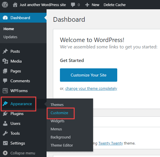
This will open the WordPress theme customizer. Depending on what theme you are using, you may see a slightly different option in the left-hand menu:
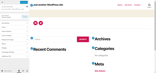
At the bottom of the screen, click on the mobile icon. You will then see a preview of how your site looks on mobile devices.
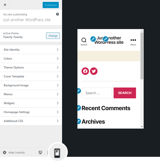
Note: Blue editing symbols are only present in the previewer. You haven’t seen these on your live site.
This method of previewing the mobile version is especially useful when you have not yet finished creating your blog, or when it is in maintenance mode.
You can make changes and see how they look before you put them live.
2. Using Google Chrome’s DevTools Device Mode
The Google Chrome browser has a set of developer tools that let you run various checks on any website, to see how your website looks on a mobile device.
Just open the Google Chrome browser on your desktop and go to the page you want to check.
This could be the preview of a page on your site, or it could even be your competitor’s website.
Next, you need to right-click on the page and select ‘Inspect’.
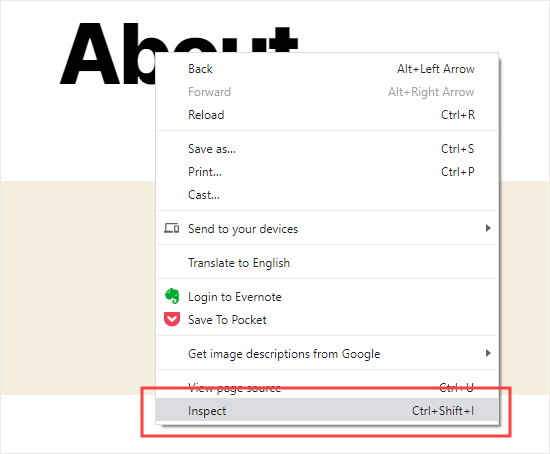
A new panel will open on the right, such as:
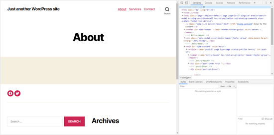
In the developer view, you will be able to see your site’s HTML source code.
Next, click on the toggle device toolbar button to change to the mobile view.
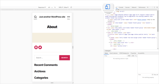
You will see that the preview of your website will shrink to the mobile screen size.
You’ll also notice your website’s appearance change to the mobile view. In the example above, the menu has fallen down and the Search icon has moved to the left instead of the right of the menu.
When you move your mouse cursor over the mobile view of your site, it will become a circle, such as:
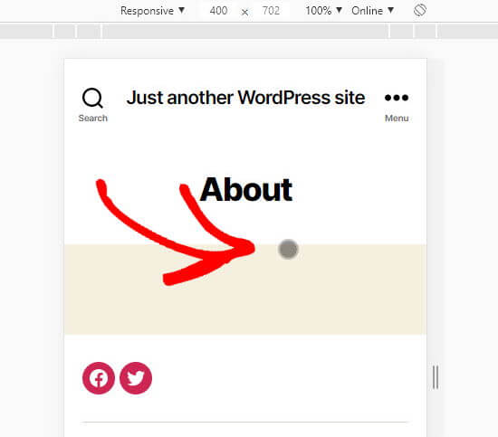
This circle can be moved with your mouse to mimic the touch-screen on a mobile device.
You can hold down the ‘Shift’ key, then click and move your mouse to pinch the mobile screen to zoom-out or zoom-in.
Above the mobile view of your site, you will see some additional options.
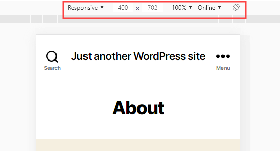
These let you do several extra things. You can check how your site would look at different types of smartphones. You can also stimulate your site’s performance on fast or slow 3G connections. Even you can rotate the mobile screen using the rotate icon.
How to Create Mobile Specific Content in WordPress
It is important that your website has a responsive design so that your mobile visitors can visit your website easily.
But simply being a responsive site cannot go very far. Users on mobile devices often look for different things than desktop users.
Many premium themes and plugins make you different display elements on desktop vs mobile. You can use a page builder plugin like Beaver Builder to edit your landing pages in the mobile view.
You should definitely create mobile-specific content for your lead generation form. On mobile devices, these should ask for minimal information, ideally just one email address. They should also look good and close easily.
A great way to create mobile-specific popups and lead-generation forms are OptinMonster. It is the most impressive WordPress popup plugin and lead generation tool in the market.
They have specific device targeting display rules that show you different campaigns to mobile users vs. desktop users. You can also combine it with OptinMonster’s geo-targeting feature and other advanced personalization features to get the best conversion.
We hope that this article helped you learn how to preview the mobile layout of your site.
