Want to create your own contact us page? To start you off, here are some examples.
In order to convert site visitors into customers, websites’ contact pages are vitally important. Here are some fantastic examples of contact pages to help you figure out how to improve your site and increase revenue.
What makes a great “Contact Us”page?
A good contact page should…
- Describe why someone should contact them and what they can do to help their visitors.
- Make it easy for visitors to get in touch by including an email and phone number.
- Create a short form with fields that allow businesses to determine who contacted them.
- To convince visitors to stay on their website, include a call-to-action and provide an alternative for those who don’t wish to fill out the form.
- Provide examples of the company’s thought leadership, such as recent press articles or blog posts.
- Add social media links to active accounts such as Twitter, Facebook, Instagram, and LinkedIn as a way for visitors to interact with the business.
- Direct people to a thank-you page explaining when and how they can contact you.
In the following, we have compiled 9 examples of the most impressive ‘Contact Us’ pages. Consider incorporating some of these ideas into your own design for your contact page.
1. Sleeknote

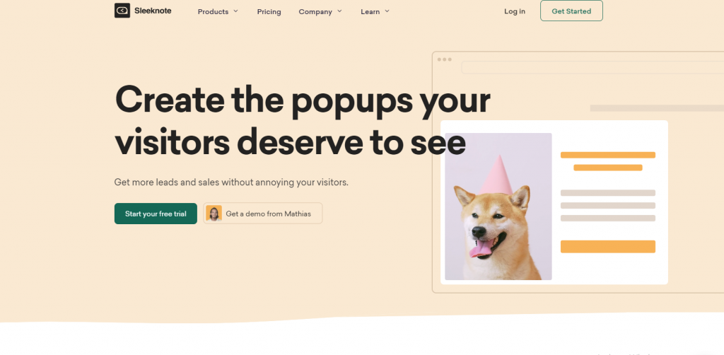
Sleeknote does more than just offer forms; it offers links directing the user to additional information and popular actions. Additionally, trusted logos are added as social proof.
While the form’s shortness and all the information is arranged in a condensed manner, the consistent spacing between the elements could enhance the user experience and prompt scrolling to additional content.
Even a colorful call-to-action at the bottom encourages people to sign up for a free trial. This page really is doing the heavy lifting here!
In short, include the next step on your contact us page. Utilize their attention to lead them deeper into your funnel!
2. Tune

Tune is another outstanding example of a contact us page.
In their header, they feature a beautiful image of a hero next to their contact us page. On the left side, underneath their hero image, they give details about their company as well as present a reason for new prospects to get in touch with them through the form.
Its purpose is to enable prospects to submit presale inquiries easily. In addition to their form, they also feature a direct call to action aimed at their existing customers.
Occasionally, existing customers will submit support questions through the contact form instead of sending them to the support page.
3. Marvel App

What an interesting example! Marvel’s contact page features a simple, general form for users to fill out, or users can segment based on what they need (i.e. sales, press, or support).
Furthermore, real images in the location section show a face to a brand and give a sense of the company’s culture (employees who seem happy at work are an advantage).
By incorporating visual cues in the design, one could subconsciously guide the eye to the information below the fold, aiding in guiding the user’s attention.
Make sure you show some personality. With illustration and actual photography, this page illustrates their brand culture in a way that makes them appear approachable.
4. Choice Screening

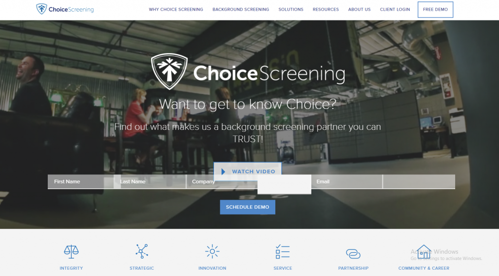
It is Choice Screening’s copy that stands out most on its Contact Us page. The quality of this support can’t be beaten – it all starts with that straightforward, delightful “Talk to a Human” header.
After all that great copy, an organized contact page includes all departments’ email addresses and a contact form. Although the form is long for most businesses, it is likely necessary to help a company organizing all of their inquiries to have so many field sections.
Think about whether it is more important for you to receive more high-quality inquiries or more inquiries. Some businesses might find it OK to use a longer form, so long as they have other options for people to contact them.
5. JetBlue

Frequently asked questions and answers can be accessed directly from JetBlue’s contact page. Users can reach out via email or phone if they are unable to find answers to their questions.
Unlike most other companies, JetBlue doesn’t have a contact form on its website. Customers who need immediate assistance with their questions often face this frustration.
This is how you can create a contact form
Use a plugin to add an FAQ or knowledgebase to your website.
6. Achieve3000

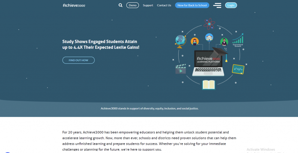
There are a lot of different kinds of customers that visit Achieve3000’s website – and their reason for contacting them can vary a lot. It’s for that reason they’ve decided to go deeper than one size fits all.
Following that enticing hero image and a couple of words explaining how to get in touch, you’ll find three different options: Request a demo, contact a sales representative, or talk to customer service.
All of these options lead to their own landing page, such as the one below. This is a great way to meet the needs of your different web visitors.
7. Zendesk

Zendesk’s contact us page hits all the major needs while maintaining a clean design and even integrating self-selection. Users can choose between answering a sales representative’s questions or visiting the help center for product and account support.
The user can find what they’re looking for more easily if the website shows them the content relevant to them. Finding what you need on a website is frustrating, but there’s something worse than not being able to find it.
In addition to location information, a map is also provided.
It’s all about simplicity. Provide clear guidelines for users looking for help with something specific.
8. Legalia

Here’s another clean, functional contact page. The information, such as a short form, is consolidated into a smaller space without feeling crowded.
This is accomplished by changing those large images of the building into maps of the locations, which can be done by clicking on the “voir le plan” (“view the map”) link below the address.
A Contact Page Designed Like This
Make use of a multi-column form to save space.
9. Atlas 1031 Exchange

Atlas 1031 Exchange’s contact page appears to lack a slick design at first glance. However, when you closely examine the homepage, you discover that it contains every important aspect that makes a great contact page – starting with the functionality.
Towards the bottom of the page, they describe how responsive they are: “We appreciate your feedback and do our best to answer your questions.” Then they explain explicitly what people will receive by asking questions, such as a promise for a short response time of 12 hours or less aside from easy-to-read contact information, social media buttons, offers, and even recent blog posts, the page contains easy-to-read contact information.
Conclusion
We’ve compiled a list of some of the most effective ‘Contact Us’ pages out there.
Look at the contact page of your company and see how you can make it more pleasing to your visitors – and if you need to make any adjustments.
