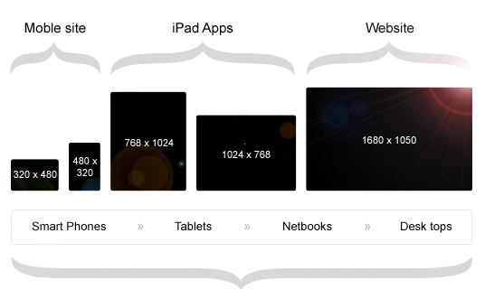
Websites now play an important part in the success of practically all businesses. Having an appealing website is a must if you want your company to reach as many people (or other businesses) as possible. In today’s world, customers access the internet via a variety of devices such as laptops, tablets, desktop computers, and mobile phones. It is critical to follow responsive web design standards to ensure that your website shows consistently across various devices. Responsive web design enables developers to create code that easily adjusts, resizes, and repositions content based on device screen sizes. Let’s have a look at four characteristics of responsive web design.
Adapting to all display sizes
Flexibility and adaptability are critical components of responsive web design. The ability to adjust to different screen sizes improves the user experience. When it comes to effective web design, positioning images, fonts, and navigation to make your website more appealing is critical. The ability to do so results in a favorable, user-friendly platform for consumers. Adapting to various screen sizes adds fluidity and transparency to the accessible content. The layout of content has a significant impact on how users consume information. For example, depending on the device, organizing the content in rows and columns makes it more understandable. A one-column layout, for example, is advantageous for mobile phones, whereas a three-column display may be more advantageous for a desktop.
The arrangement of the material is handled in the code through responsive web design, requiring no user intervention. If you are looking for a website design agency in Philadelphia, you should focus on organizations that have delivered responsive websites in the past.

Website Speed
When developing a website, it is critical to consider speed as one of your top concerns. The speed with which your website loads can have a big impact on how your clients perceive your company. Ones that take more than five seconds to load are more likely to be abandoned than pages that load in one or two seconds.
The speed of your website will also have an impact on your Google search ranking. Websites with slower page load speeds are more likely to rank lower than websites with faster page load times. There are numerous techniques to improve the speed of your website. Using an efficient CSS layout, optimizing images, and integrating caching are all part of this. Customers get a direct favorable experience when pages load quickly.

Breakpoints
Breakpoints are the foundation of sustaining responsive web design. They are vital filters that are applied to CSS styles for various devices. Breakpoints assist web designers in describing device categories and writing code that defines how a web page will display for each type of device. Breakpoints enable you to adjust the style and layout of your websites on different devices.
Two factors must be considered when deciding how many breakpoints to use. To begin, you can select breakpoints based on existing content. The layout for displaying this content will influence how many breakpoints are used. Second, it is preferable to employ a limited number of breakpoints. Limiting yourself to three to four breakpoints at most will help you be more flexible when framing your site content.

Image resizing
Images are essential in site design. The type and quality of photos you use have a big impact on how people perceive your company. You may want to adjust the size of an image before utilizing it on your website at times. Pixelated images, on the other hand, would provide a false impression to clients who are viewing the page for the first time. To get around this, look into tools that magnify images without sacrificing quality.
While it is critical to select relevant photos for the web page, it is also critical to ensure that the images selected display pleasantly on displays. The use of a relative length unit of photographs is required for responsive web design.

Allow Access to All Browsers
Websites That Are Responsive The designs are more search engine friendly. Which of the following is the most significant and advantageous aspect of responsive websites? As we all know, the better a website’s compatibility with search engines, the bigger its visibility. Visibility characteristics will eventually supply the convenience of easily acquiring web pages on all gadgets. This visibility will drive more people to your site, which will boost your income graph.
Google, the most popular search engine, prefers responsive websites. It also suggests mobile-optimized websites for the intended mobile customers.

Conclusion
With responsive web design, you can make your website look good on all devices. With responsive web design, you can expect your business to flourish and acquire consumer satisfaction.
